In the recent time I thought a lot about app development and especially about the aspects of design and functionality. I asked myself: "How can I create an app that really impresses the user by its appearance and brings value to the user?". When you talk about getting value of the functionality of an app, you have to name the concrete topic or the issue what the app is about. OK - I want to create a recipe app for the Android platform. Only a few words to the intention that I have. Actually there is no recipe app that feels like an equal replacement for a physical cook book. Of course, there a lot of apps that simply let you create recipes or fetch them from the the web. But none of those lets you do more things (publish / share / high quality print / discuss) with your recipes nor there is any app that does it in an attractive way, too. If you find an app with some of the desired functionality it either costs money or it is ugly or slow (like the german Chefkoch.de-app). The next thing is, I want to collect my own recipes or recipes that I got from family or friends. So it is a very personal thing, just like a diary or a scrap book. The last point is that I want to have the option to export and share recipes. Maybe I want to print a physical recipe book of a collection of special recipes to give it as a present to a dear friend. So this print layout has to be in a high quality, just like the layout of a professional cook book that you can buy in a book store.
So far, this is the intention of the app. Now as I described the problem, I can talk about the issues that I discovered at the design of functionality and the user interface. Maybe you have heard the term of featuritis? First of all let's have a look at the definition at wikipedia (
http://en.wikiquote.org/wiki/Featuritis). Featuritis is a phenomenon that you can discover quite often if you grab an arbitrary app from the Play Store. Often I can't figure out what are the main functions of an app. This is partially caused by a bad or overloaded view design and partially caused by a missing focus on the main intention of the app.
I also have had this problem when I developed my first apps. How can you face this problem?
First, one has to have a vision of the base idea of the app. Can you describe the functionality and the value of it in only a few sentences to other people? Are there other apps out there in the Play Store (or other app stores) that do the same or similar like your app should do? If yes, how can you distinguish yours from the other? Is there a use case or a reason why one should or would use your app instead another one? Serves the app a value to a user at all?
If you can answer these questions clearly and positively (this is what I tried to do in a short way above), you may begin designing and developing your app. Next you need a simple, catchy and expressive name and a logo. The logo and the name brings more motivation to me and lets me identify myself with the app to be developed. This is definitevly no easy step and very hard to describe rules for. So I will go on. ;-)
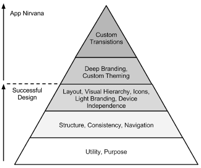
Maybe you have heard of the hierarchy of needs by Maslow yet? Actually this hierarchy (or pyramid) is related to the needs of a human being. In this hierachy physiological needs like breathing, food, sleep etc. form the base of the pyramid. Only if those needs are met, there come up further needs (security needs) like a secure home, employment and so on. There are still more steps that come after these two. As you may expect there is an adopted concept of this hierachy of needs for the domain of (app) design. You will see it in the following figure. I found this in a Google IO talk with the topic "Android Design For Success" (
https://www.youtube.com/watch?v=2NL_83EG0no).
.png)
You also may have noticed that I already talked about the first step (utility and purpose) quite at the beginning. So, by going the second step, the real development can begin. Now you should start to think of the structure of your app and how the user will navigate through your screens later. To consider this step technical you should think of which fragments are needed, to present the information in the related views. You have to arrange the views and define which information should be presented in what kind of view. This brings us to the question: "How can you provide a consistent structure and layout?". Each view transition should be logical and understandable to the user. Fulfill the expectations of a person, that knows how Android-4-apps behave!
When you have come so far, you can take the next step. Now you can bring a simple branding into your app. Provide it with your logo and some simple design resources, like icons. Furthermore think of the huge variety of devices, their formats and different versions (API level). You should ask yourself now: "What do I want to support and what kind of devices should get a special layout to accommodate their special abilities and properties?". Maybe you will have to add support libraries or frameworks like ActionBarSherlock. To integrate this libraries into your project you will only have to change some imports. There are also some little API differences that you will have to regard. Applying these changes should not be too complicated, but it would also be recommendable to do these things in the project setup.
If you have applied these rules to your project, your app should result in a consistently and useful designed app. Users should understand the idea of your app and know how to use its features. Also the design should be alligned to the Android platform guidelines. Especially if there are already some apps that seem to be equal to yours or claim to be for the same purpose, you will have to differentiate your app from all the others. Make the user remembering your app and try to bring enthusiasm to the user. To make the user remember your app, you will have to make your app unique. This is done in the fourth step. The key is common identity (CI)! the most popular companies have a special theme or design rules applied to color, font and forms in all products that represent the company. A simple example is Facebook: So simple. A single small, white "f" with a blue backgound. And of course the like-button all over the internet. Everyone knows and recognizes Facebook at these simply and clearly designed elements. This is what you have to find for your app or for your whole project. This should burn your appearance into the users brain.
The last point is in my opinion not the most important one for success, as you already fit into the design concept of the platform by distinguishing yourself from others by your CI at the same time. But I would call it to cause the wow-effect. I think Apple with its iPhones and the whole app platform did it as the first company. There are many apps that let the user feel the elegance of the gadget merged with the design and the functionality of an app. The app is unified with the gadged and the user is just impressed by a special app. The positive feelings for the device are transferred to the app and vice versa. This is a very emotional moment which is caused by some simple methods. Let your app feel smooth. Add custom and organic transitions or other eye candy effects. Obviously such eye candy is not neccessary to make an app useful and therefore popular. But it serves the emotional and subjective character of the human mind and so puts rational aspects in another perspective. Don't get me wrong at this point. With eye candy I do not mean as much effects as possible. In contrast the trend to more simplicity and flat design shows that the simplest design might be usable and nice without having many effects or so called eye candy. It is about a natural look and feel of the user interface. This might be reached by using some animations, transitions or other effects, but it is no dogma. As it is with many other things, too: It is about the right balance! This may be the nice topping of the design of your app. Then your app will hopefully successful.


.png)