Currently, I did another try to get around with Ubuntu. My motivation for this was: I already used a kind of app dock (Docky) in Linux Mint and I really like the Head Up Display (HUD) and the app dock of Ubuntu. So I thought, let's give Ubuntu another chance. Also a comfortable thing is the integration of web applications (first class citizens).
At the beginning I also had to swallow some bitter pills: Ubuntu is very chatty! That is, especially Unity's shopping lens submits every search in the search panel (at the very first version directly) to Amazon. So I needed to remove this search lens and also others that I do not like.
Next, I needed a serious file manager. Nautilus, the default file manager, seems to be for people who do not really want to deal with files. Very strange to call this program a file manager! So I installed Nemo, which is a mighty file manager from Linux Mint. From that point, Ubuntu showed up 2 error messages at every system start. Also, I could not control anymore what icons are displayed on the desktop (trash, user home, etc.). So Unity's integration with other file managers is not very well.
The HUD and the menu at the top were one motivation for me to give Ubuntu one more try. The problem is, with my Java IDE, Eclipse, the menus at the menu bar could not be opened. So it is unusable. That is very sad. I know there may be a workaround, but it was not my intension to reconfigure and modify the whole system in order to use it.
Last but not least, I want to tell something about the app dock of Unity, whose position is at the left margin by default. Visually, I like this dock. But, as I work with an external, second display, I expect the dock to don't prevent me from using two displays. Unfortunately, when I pull a window from one display to the other one, the window sticks with the dock. Every times, it is a real fight to get the window on the other side.
Maybe, there are some tricks ans optimizations. But I want to use an operating system and not to hack it. So bye bye Ubuntu, hello again Linux Mint.
Monday, December 23, 2013
Sunday, October 6, 2013
Auto Hathway Authentication is now available on Android Play Store
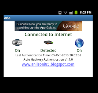
What is AHA?
How It works?
Whenever you will turn on Wifi and connect to a Wifi network on your device then AHA will determine if network is having Hathway internet by detecting the Hathway modem. Once the modem is detected AHA will continue to check the internet connectivity. For internet connectivity it will ping web after every 30 to verify that the device has internet connectivity and if the ping result is negative then it will attempt to authenticate to Hathway.
Similarly if you will disconnect Wifi network or if your Wifi network has ISP other than hathway then AHA will disable itself so that it will not use resources on your device.
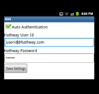
Setup
1. Install AHA from Play Store (PlayStore Link).
2. Open AHA and go to settings screen.
3. Enter your Hathway User Id and Password and Click on "Save Settings" button.
4. Now connect to your wifi network and AHA will do the rest whenver required.
ScreenShot
Sunday, August 11, 2013
Solved: Ployer momo9c keep on resets to factory defaults on every restart or shutdown
Ployer momo9c and other A10 devices running android ICS or CM10 sometimes resets to factory defaults after every reboot. This usually occurs after the update of busybox. To correct the issue go to the Terminal (using adb, Terminal Emulator or any other approach) and copy the busybox binary from /system/sbin or /system/xbin to /system/bin. Below are the command sequence to run
su
mount -o rw remount /system
cp /system/sbin/busybox /system/bin/busybox
If you are not able to find the busybox binary at the path mentioned above then use which command to locate the busybox.
which busybox
Saturday, August 3, 2013
Unhandled exception in Google Blogger API due to request redirection
Google has everything i can think of!!! I was looking for something by which i can write my own blogger client using which i can create/modify post and i found this wonderful collection of Google API SDK at https://developers.google.com/blogger/docs/2.0/developers_guide_dotnet. Not only it has got the Blogger API but i also has the API for other google services like Picasa, Contacts etc. The underlying protocol of these API is based on REST and JSON. Its .NET library source is available at http://google-gdata.googlecode.com/svn/trunk. After the check-out when i launched the solution i found it pretty simple to start because the source contains nice samples for each service and to understand the basics classes of the API.
Everything was good until i launched the sample Blogger client and encountered an unhandled exception due to Http redirection. Basically the API raises a Http requests to blogger API URL using an instance of System.Net.HttpWebRequest class and the AllowAutoRedirect property was not set to true due to which the HttpWebRequest.GetResponseStream() method was throwing an unhandled exception whenever the request was redirected. For the resolution, i simply added following line after the call of EnsureWebRequest() in GDataRequest.Execute() method.
(this.webRequest as HttpWebRequest).AllowAutoRedirect = true;
This was my quick resolution to the issue there may me some fix or configuration provided to either avoid or allow redirection. Hope in future this post will help someone like me.
Friday, July 26, 2013
Our Way To The Final Logo Design
A while ago I wrote about how to design a successful app (to the post) whereby I referred to my own app project. I'm currently developing a recipe app for Android with my project partner Marlene Knoche (her blog). The basic concept for this app is about collecting personal recipes. Personal means that you got these recipes from other friends or your family (maybe your grandma). I personally wrote those recipes in a notebook (out of paper). typical problems with such paper books are:
I already reached the end point of the logo design phase and currently I create the basic views and their design. The process of the logo design is what I want to reflect in this post.
- When you use them, the paper gets dirty or even wet (from cooking), letters get blurred.
- When the book is full you have to chose a new book or put in single sheets of paper.
- You cant reorganize your recipes.
- You typically document the instructions of a recipe only with words. There is no multimedia content
I already reached the end point of the logo design phase and currently I create the basic views and their design. The process of the logo design is what I want to reflect in this post.
Actually, the time to design the logo that finally is used in the recipe app was quite long and we've took a lot iterations to get clear of the base idea behind the logo design. To name it immediately at the beginning, it actually took that much time as the app name wasn't determined at all, too. This, as you will see, reflects in the variety of different design approaches.
Everything began with a spontaneous mind mapping session with my project partner. First we inspected names and design ideas of other recipe apps. The result of this overview was:
- Most logo designs contained typical cooking symbols like cutlery, chef's hat, dishes, etc.
- Often the logos are of a illustrative and iconic type.
- All kinds of cooking metaphors are used to much.
Then we started brain storming and mind mapping.

This mind map indeed captures quite good the essential idea of the app. For defining a name and the logo it is necessary to have this idea in mind.
Then we noted all name ideas for the app. There came lots of good and bad ideas: Cook Stories, Food Stories, Cook Time, Media Meal, Food Print / Printfood, Augenschmauß ... these names are just some of the many ideas we had. But there was not really a great idea.
Some time later we had a nice idea:
GREATFOOD - sounds like Grapefruit, so a logo idea was born, too
 | I really liked the idea of the logo. But unfortunately there is a quite subtle connection to the NBC logo and there are already quite similar apps in the Google Play store. So we dropped that thought of the name and went on. |
 |
The top right logo draft should correspond to the German word play "Mahlzeit", which actually means meal, but in German consists of the two parts meal ("Mahl") and time ("zeit"). As you may see we came to this idea with the kettle, the magic stick and the recipe note. To me and my project partner the graphic design of the logo looked beautiful. The colors we have chosen are fresh which correlates with the whole cooking and grocery topic. And by chance green is my favourite color.
Then we had an idea of the name for the app: "RezepTour". The problem with the logo was, when I showed it to other people (with the size of a real app logo on a device) they could not figure out clear enough what this app should be for. They said something like: "Is this a magic topper?" - the magic stick matches to that interpretation, additionally. To me it was a bit surprising that only few of them interpreted this app logo as it was intended, first.
So, next iteration!
Actually the next idea was quite spontaneous and is about the export and print feature of the app. Falling late into sleep the night before and thinking about the app - there it was: Printzept! The name sounds unique, the idea behind the name corresponds with the most important feature of the app. Like the previous name this one also is mixed out of two words: Print + Rezept (German: recipe). The logo design was done immediately next morning. I drew the name and some styled letters of it to paper.
My project partner opened the vector graphic program, looked at some free fonts and just created the logo that until now is our very final version ;-)

Some days ago I read a really informative and great article: http://www.adhamdannaway.com/blog/branding/a-systematic-approach-to-logo-design
According to this article I would classify this logo as a typographic logo. This actually distinguishes very much from existing recipe app logos. As mentioned above, most logo designs are of an illustrative or iconic type. The simplicity comes from the flat design and the reduced color selection. Knowing the name "Printzept" it is still readable or recognizable when the logo is shown in app icon size.
Unique & simple - I love it!
Saturday, July 13, 2013


Subscribe to:
Comments (Atom)